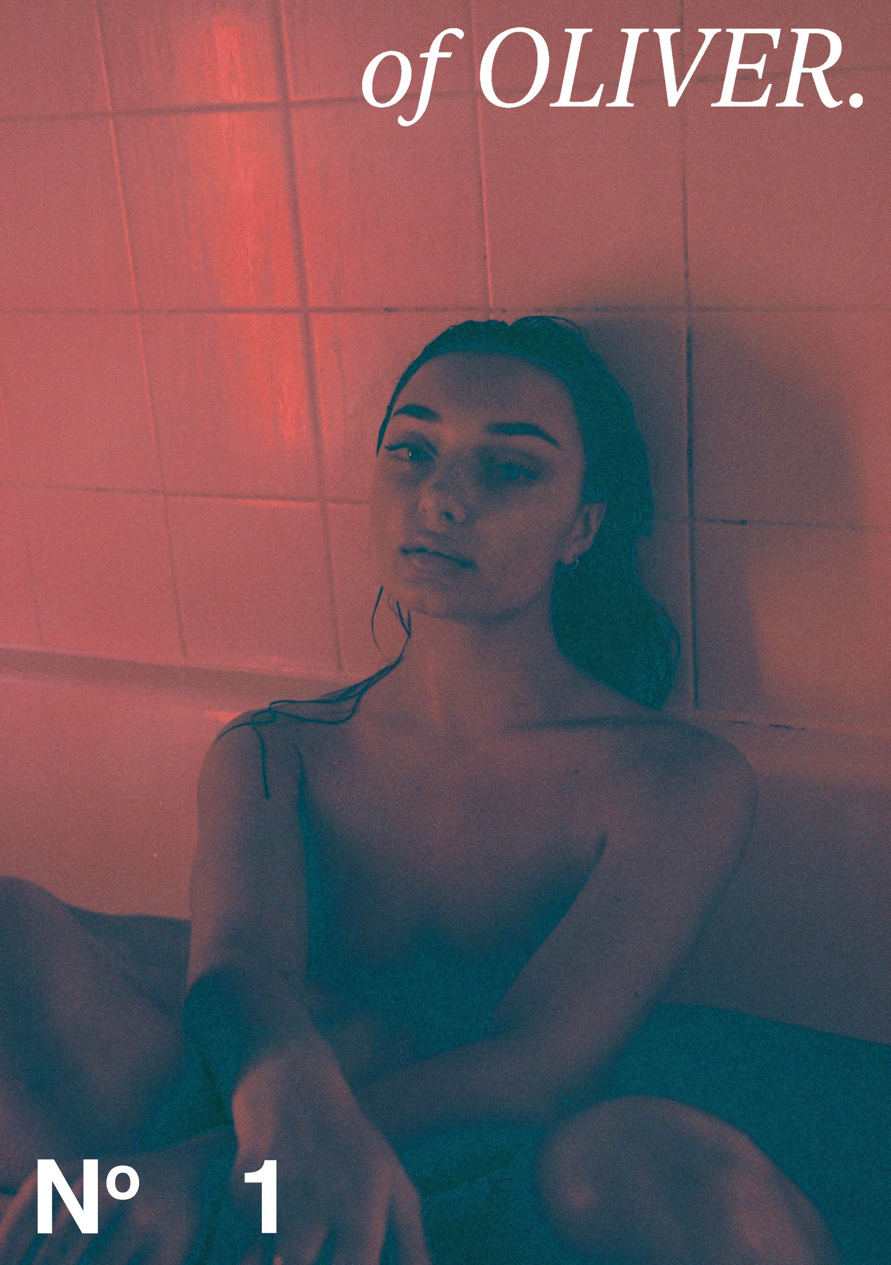
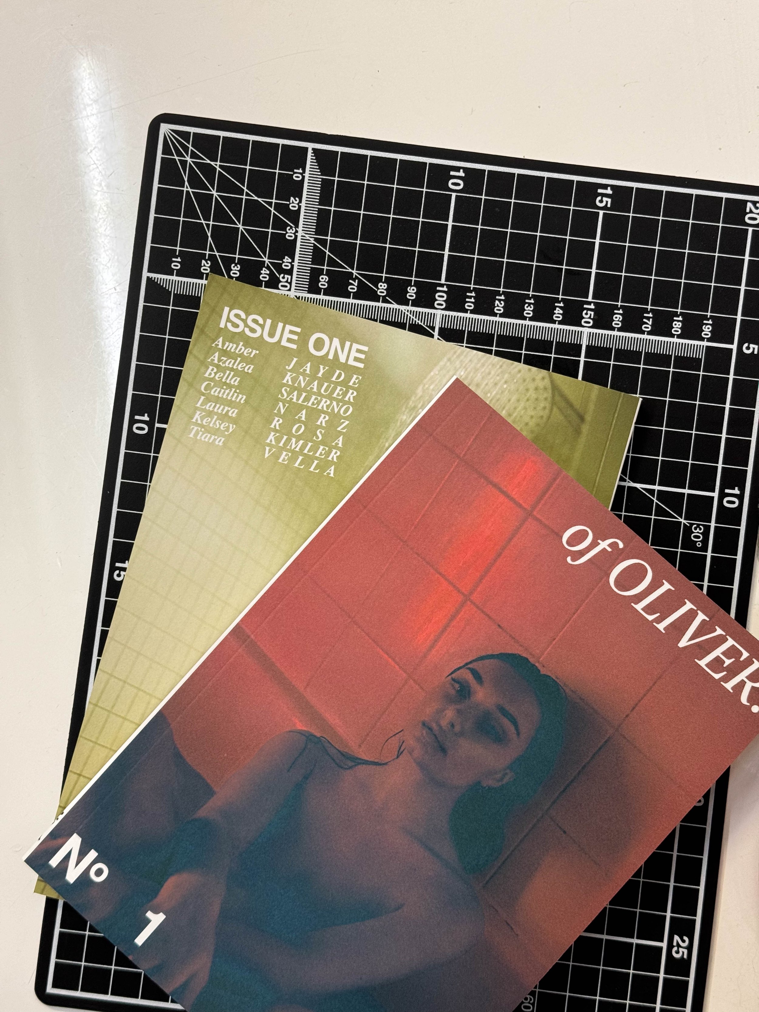
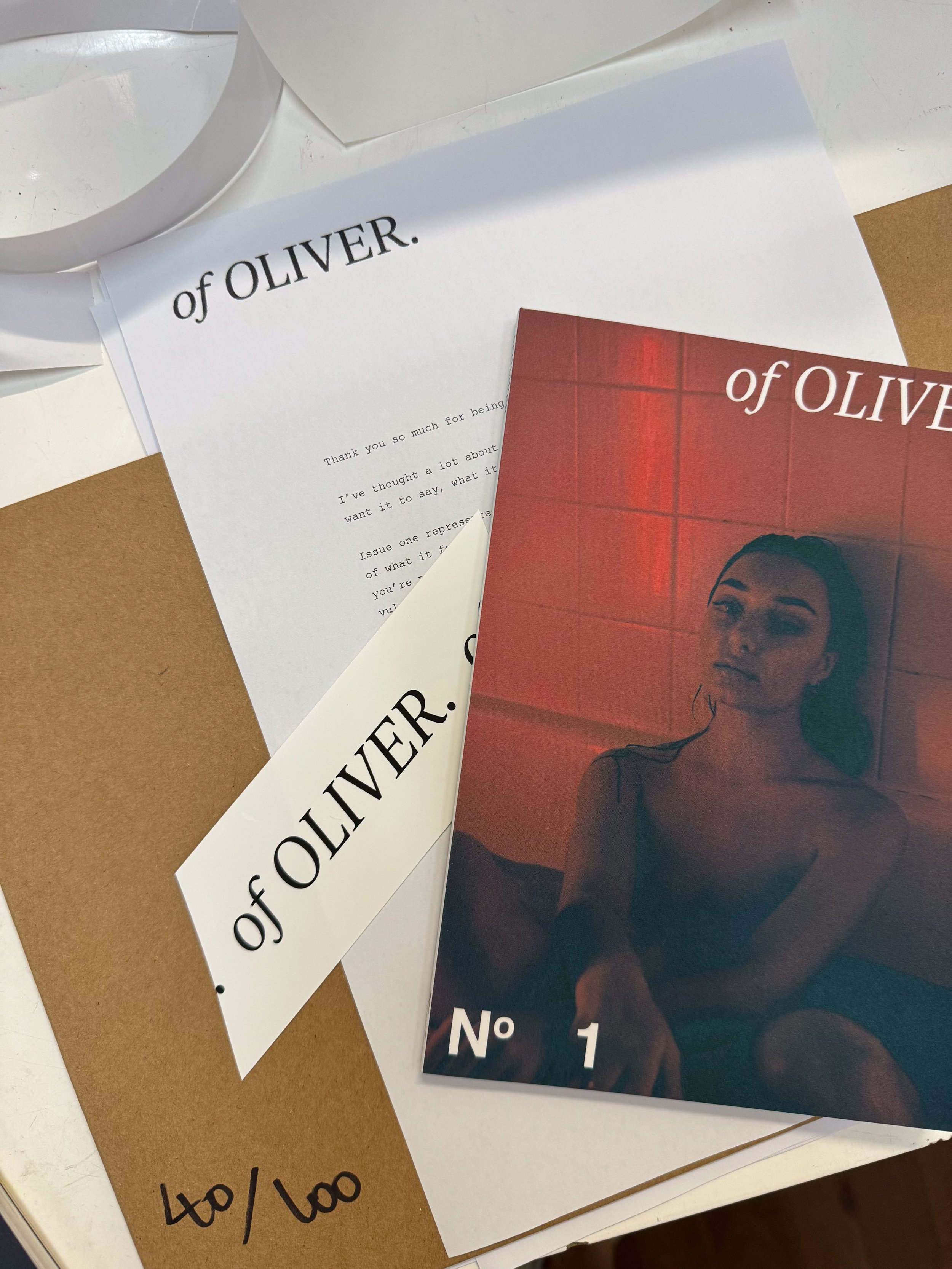
Publishing My Zine: Finishing OfOliver Issue No. 1
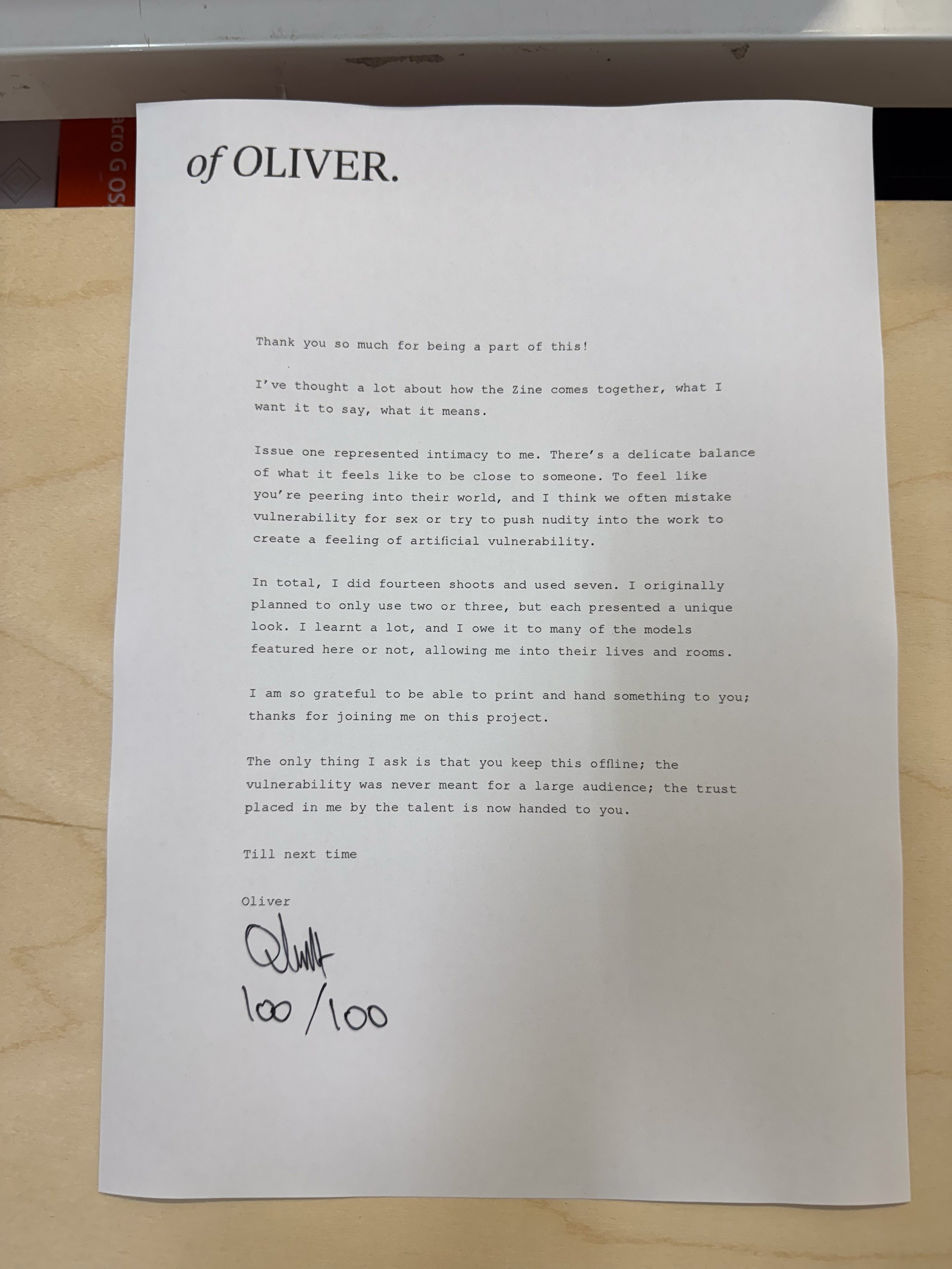
Putting together my Zine was a departure from my regular work, originally intended as a small personal project; much like most things I do, it took up much more time than anticipated. It was an idea sparked by my therapist, who suggested I stay creative following what looked to be a slow summer with a forecast promising more rain than sunshine and my schedule looking worryingly empty; I figured, why not?
I know creative burnout is a real thing. We artists often find ourselves caught in the cycle of equating our worth with our success, and even today, it weighs on me. This project was a chance to step away from those pressures and create something purely for the love of it.
So, I announced my plans and dove headfirst into it. I realised slowly that capturing the style of shots I wanted was trickier than I had thought. I didn’t have a vocabulary to explain it.
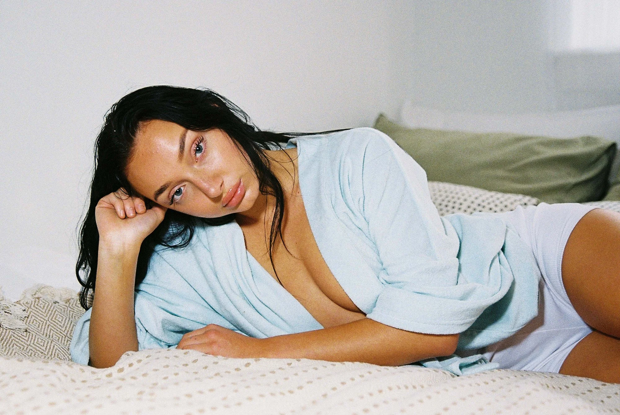
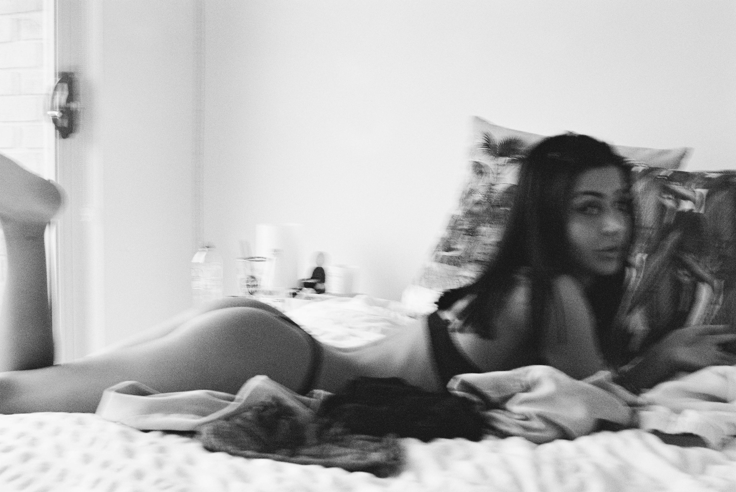
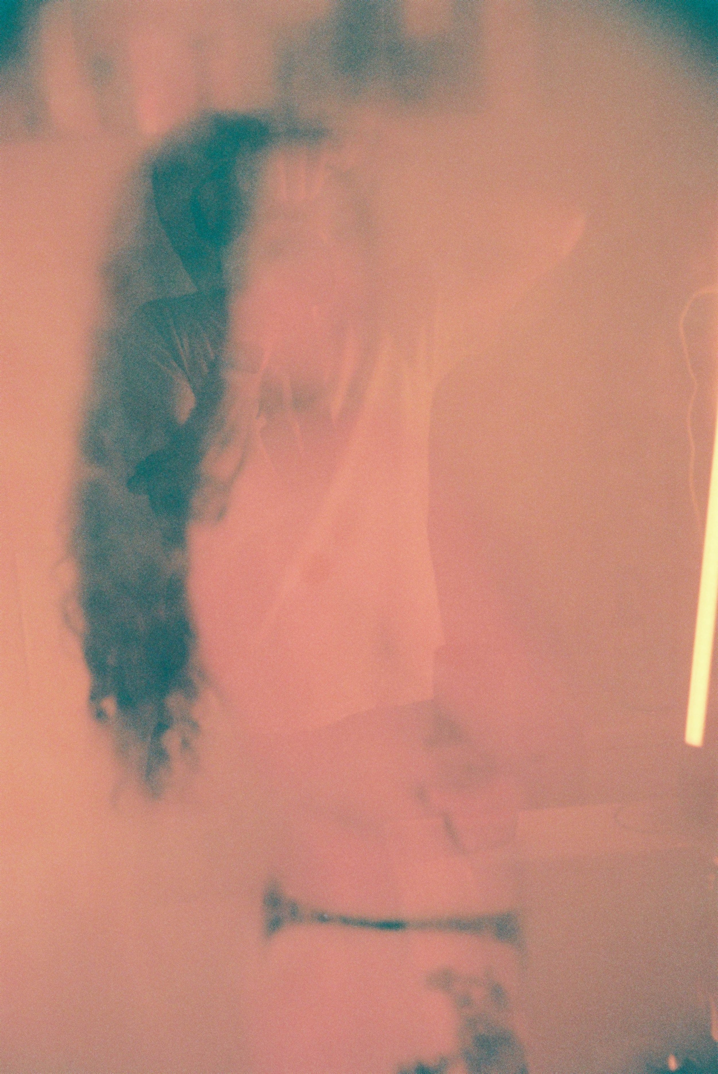
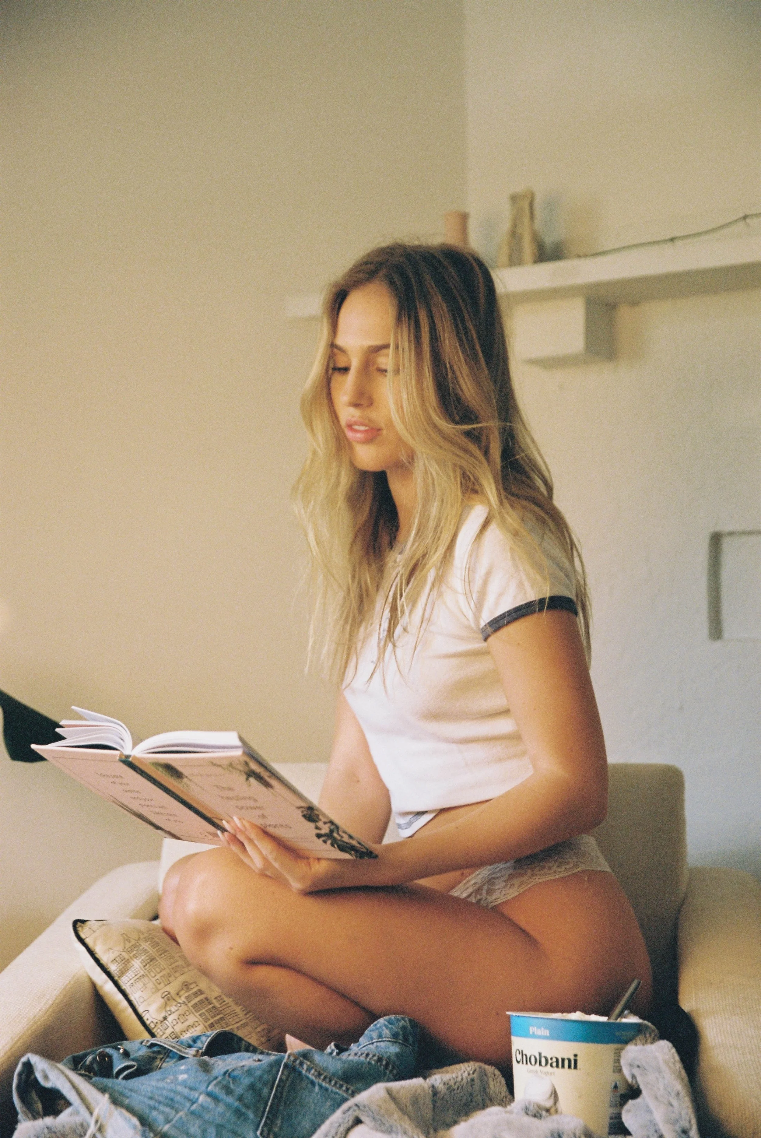
Referencing has always been a massive part of my work; there also needs to be ways to explain the emotional nuance. The only way I’ve gotten better at that is with practice; at first, it was about how I framed a shot and the technical aspects like lighting, but as I got better at this, my work lost a lot of that emotional intention, it became clinical and boring, without any exciting point of view. This process has repeated itself over and over within my work, and with the Zine, it was no different. I wanted something that felt intimate, shot in people’s homes, a reflection of what it is like to feel close to someone, but I don’t think I nailed that, not quite; I think it lacks the carefree element in a lot of the work I regard as feeling safe; instead, I think it embodies too much of my male gaze, but these things do evolve—a context I will revisit in Issue Three.
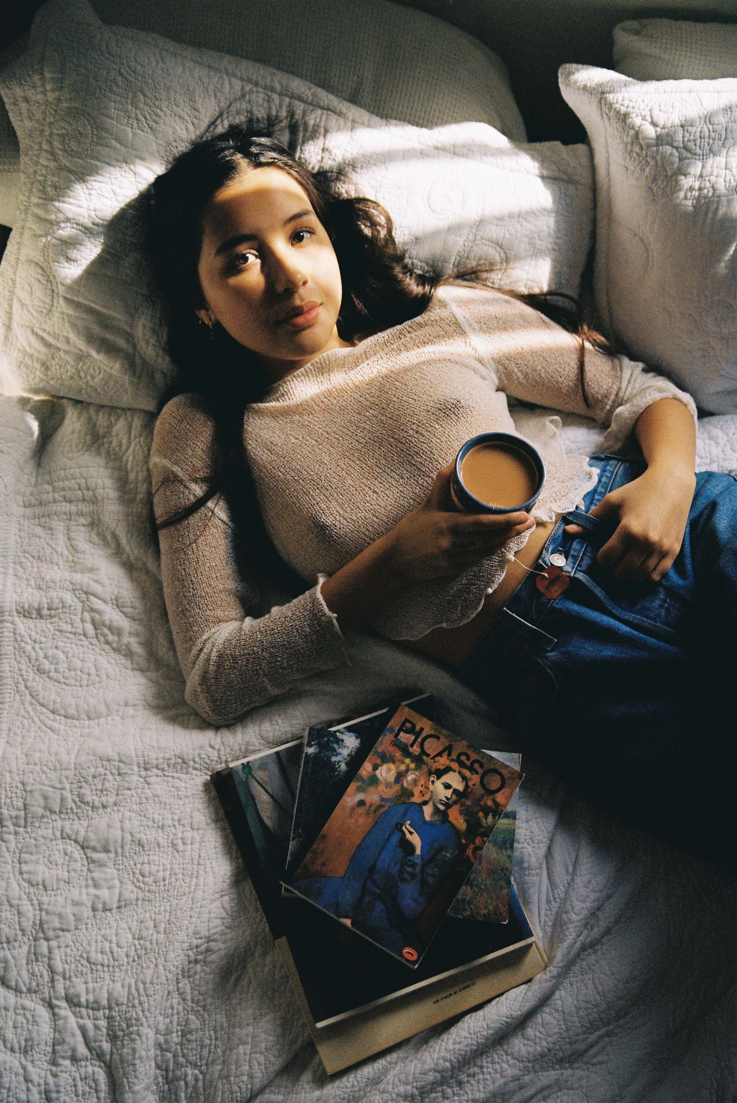
It wasn’t until around the sixth or seventh shoot, working with Kelsey Kimler, that things really clicked. Kelsey understood my vision, and her movements breathed life into the photos. That missing ingredient was there, and emboldened, I moved forward at a point where I felt ready to quit. Feeling inspired by this breakthrough, I returned and re-did one of the earlier shoots, determined to keep pushing forward. This project was shaping to be more than just a collection of images. It was moving me towards being a better communicator.
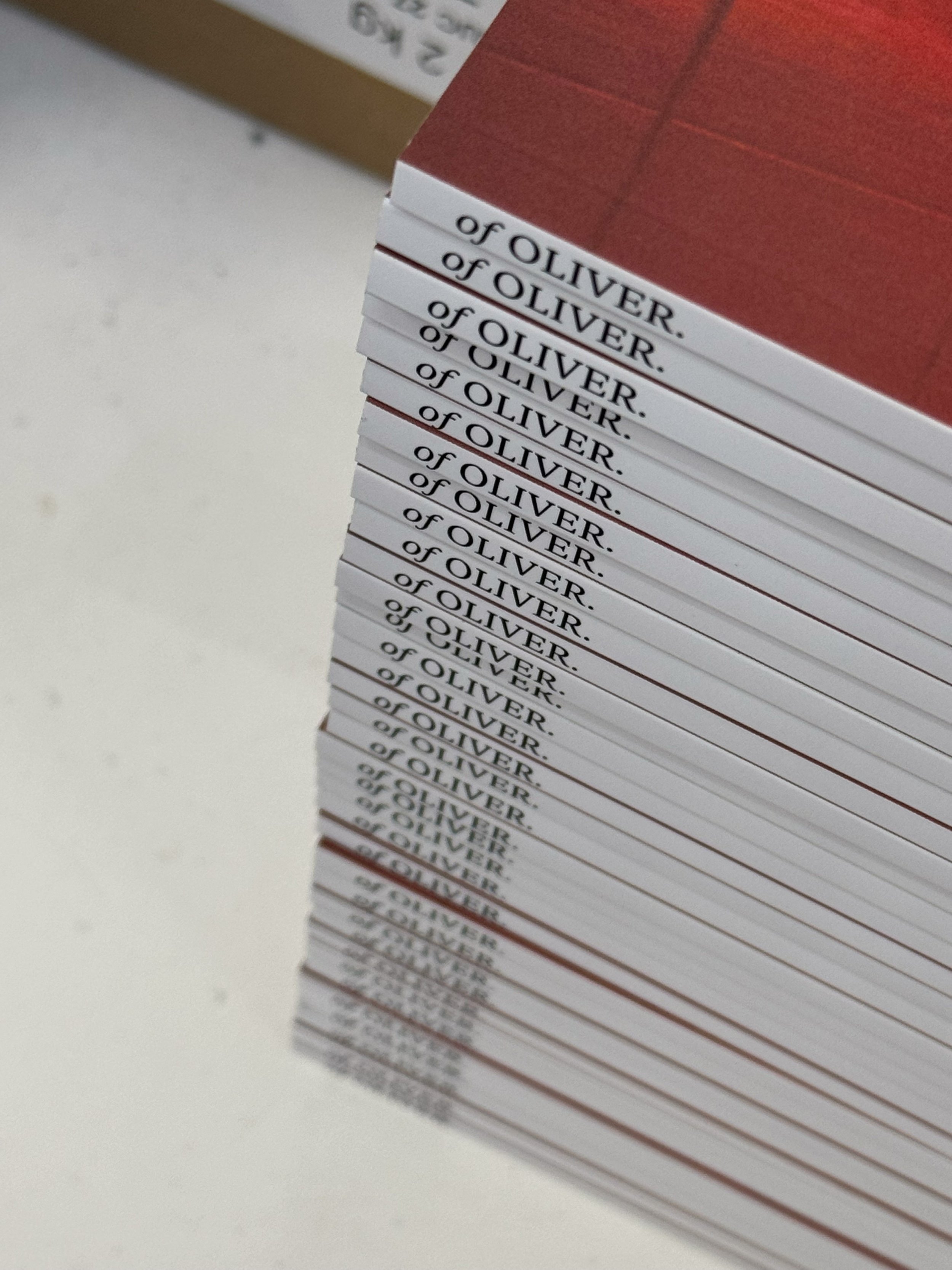
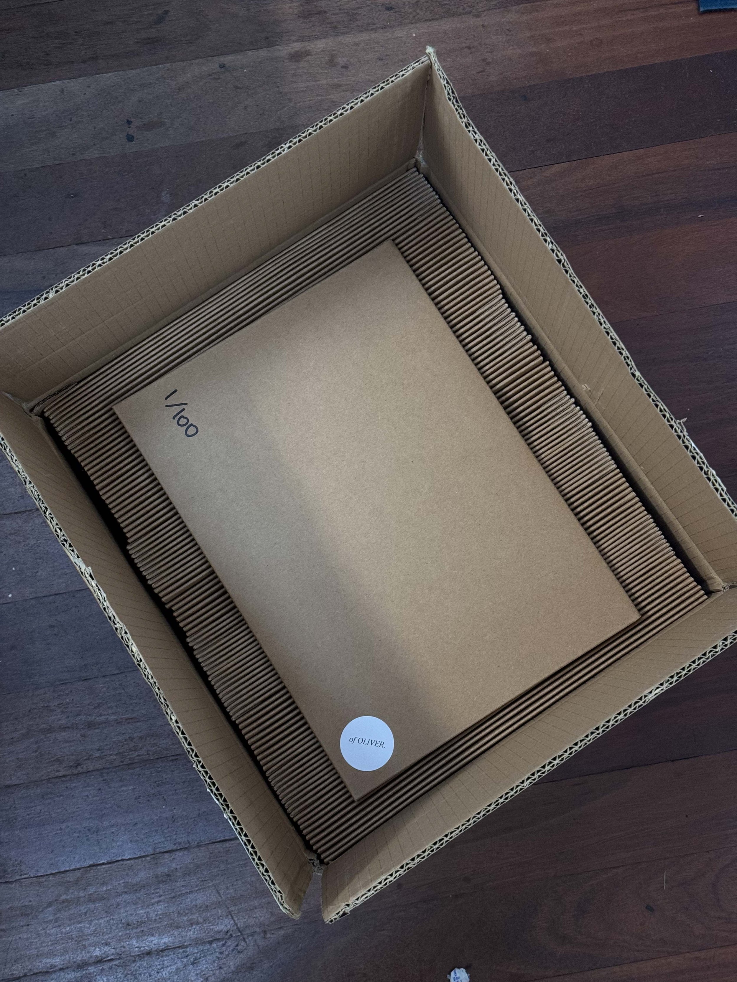
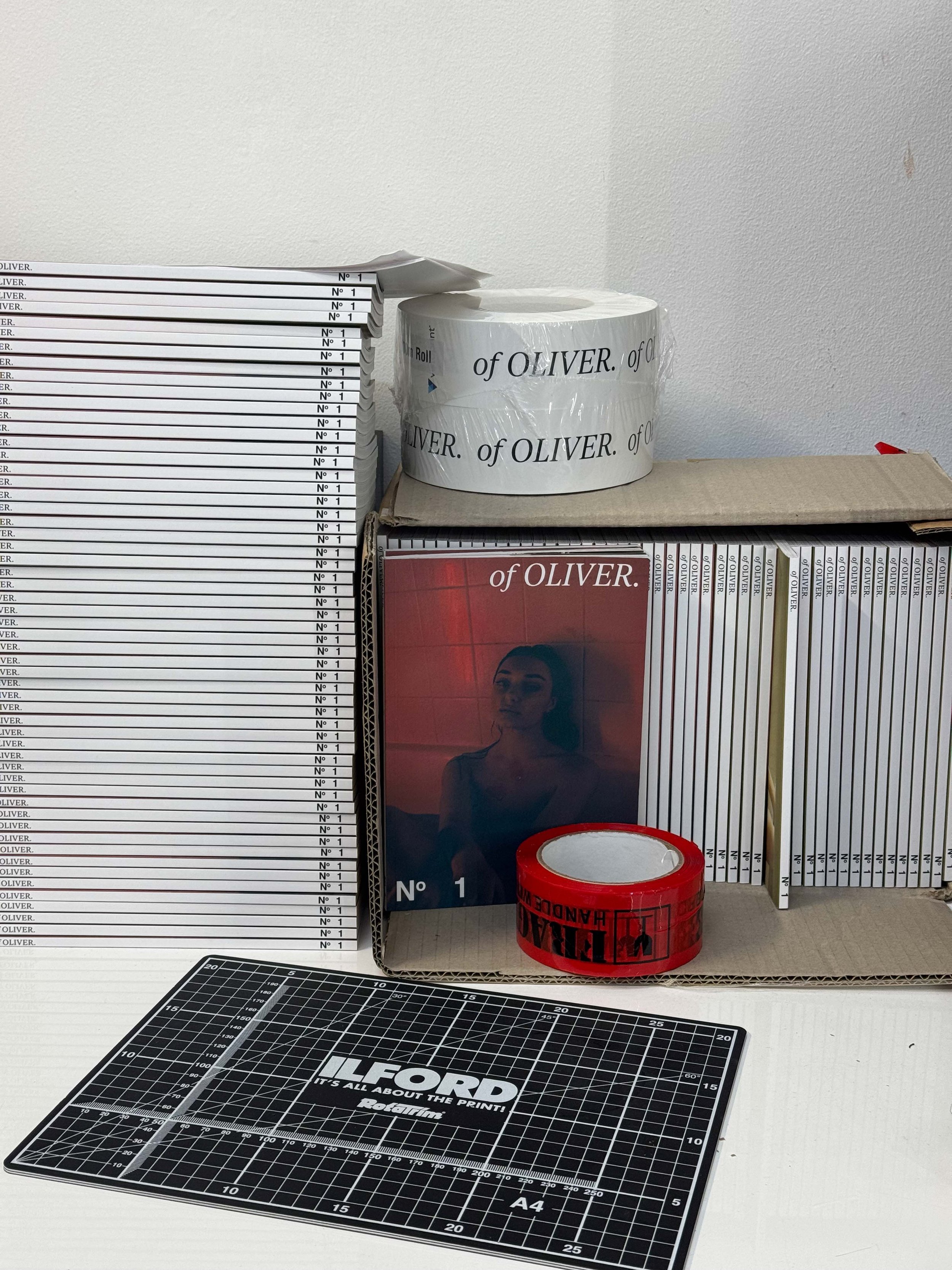
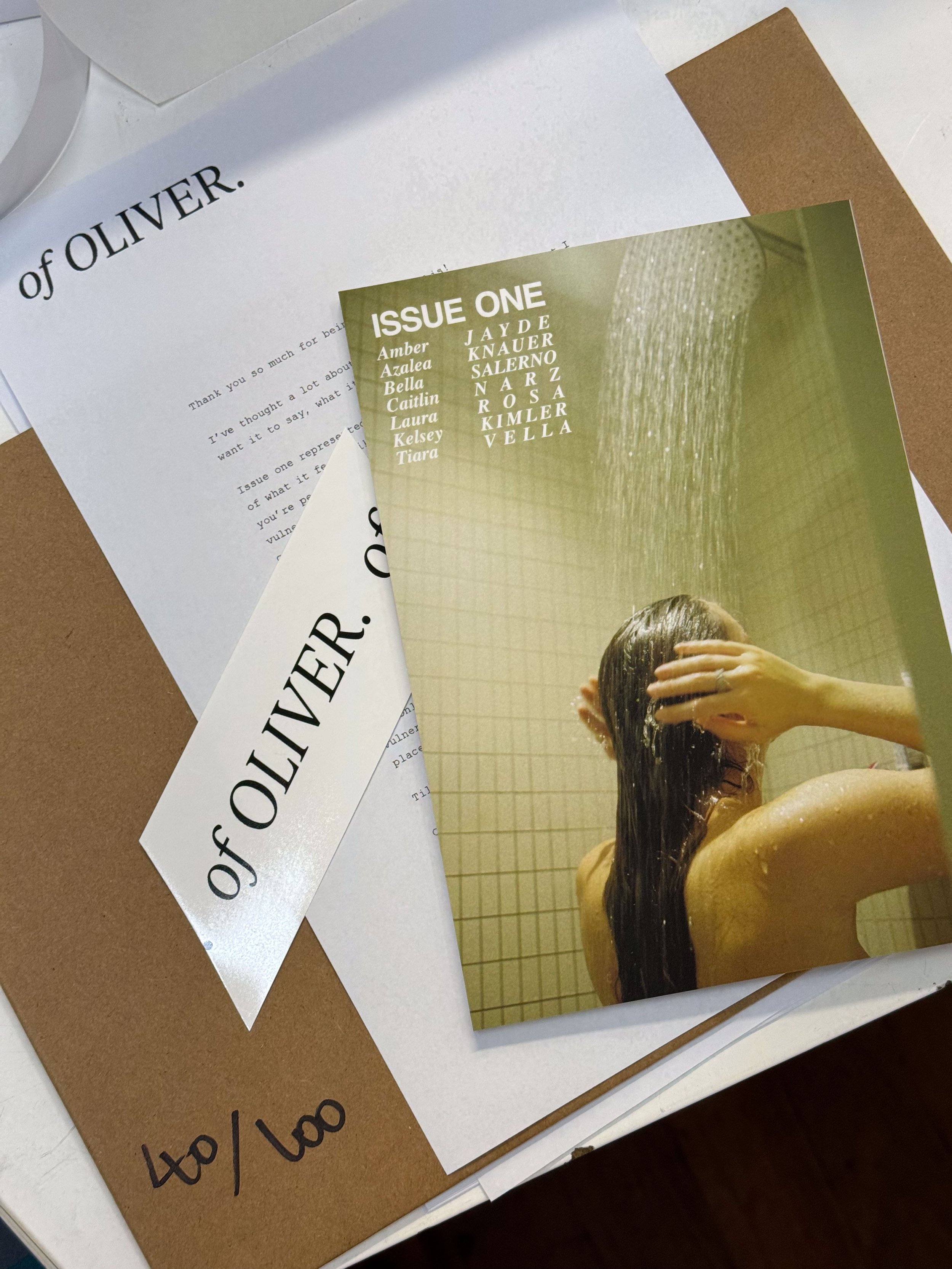
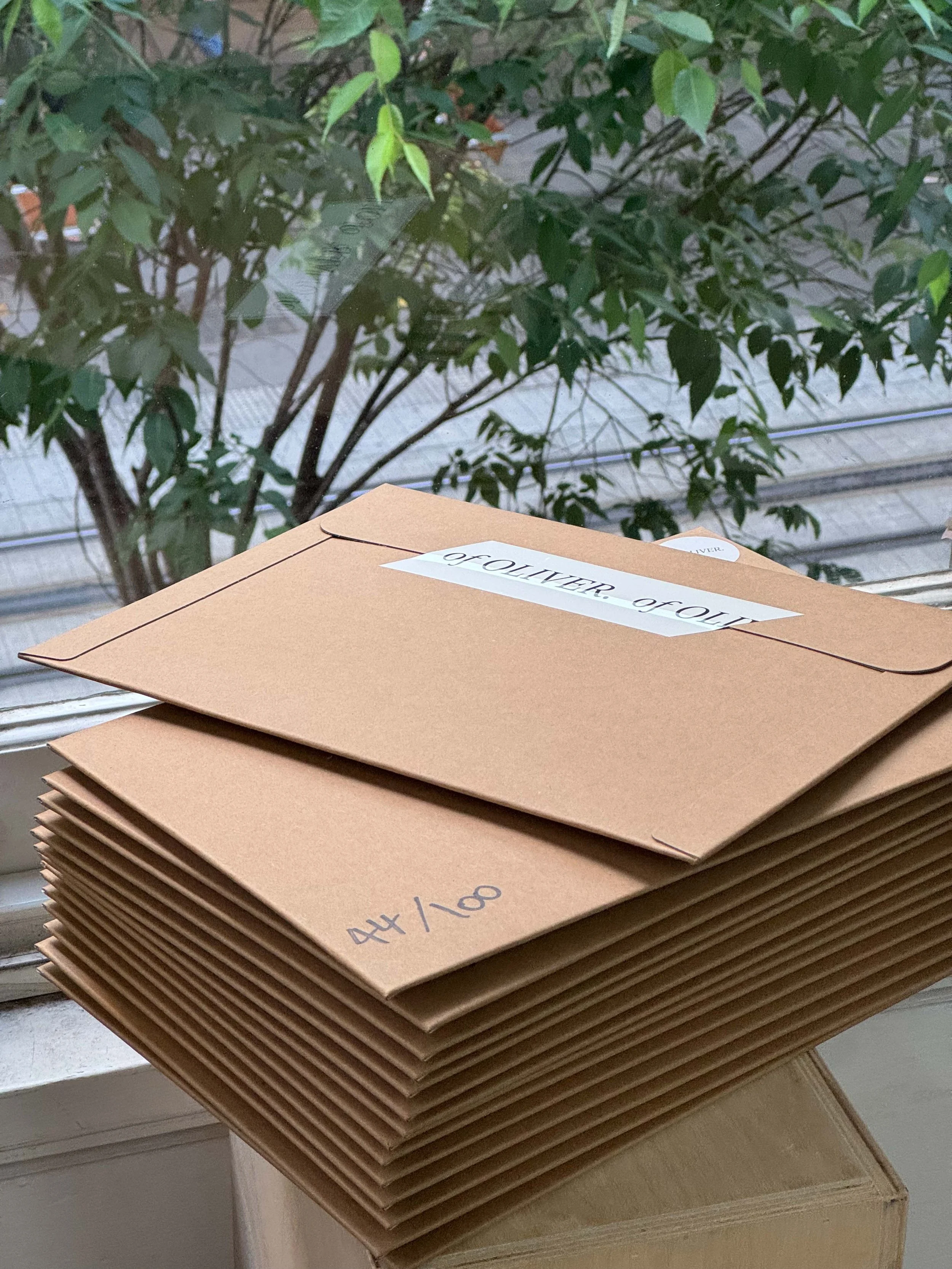
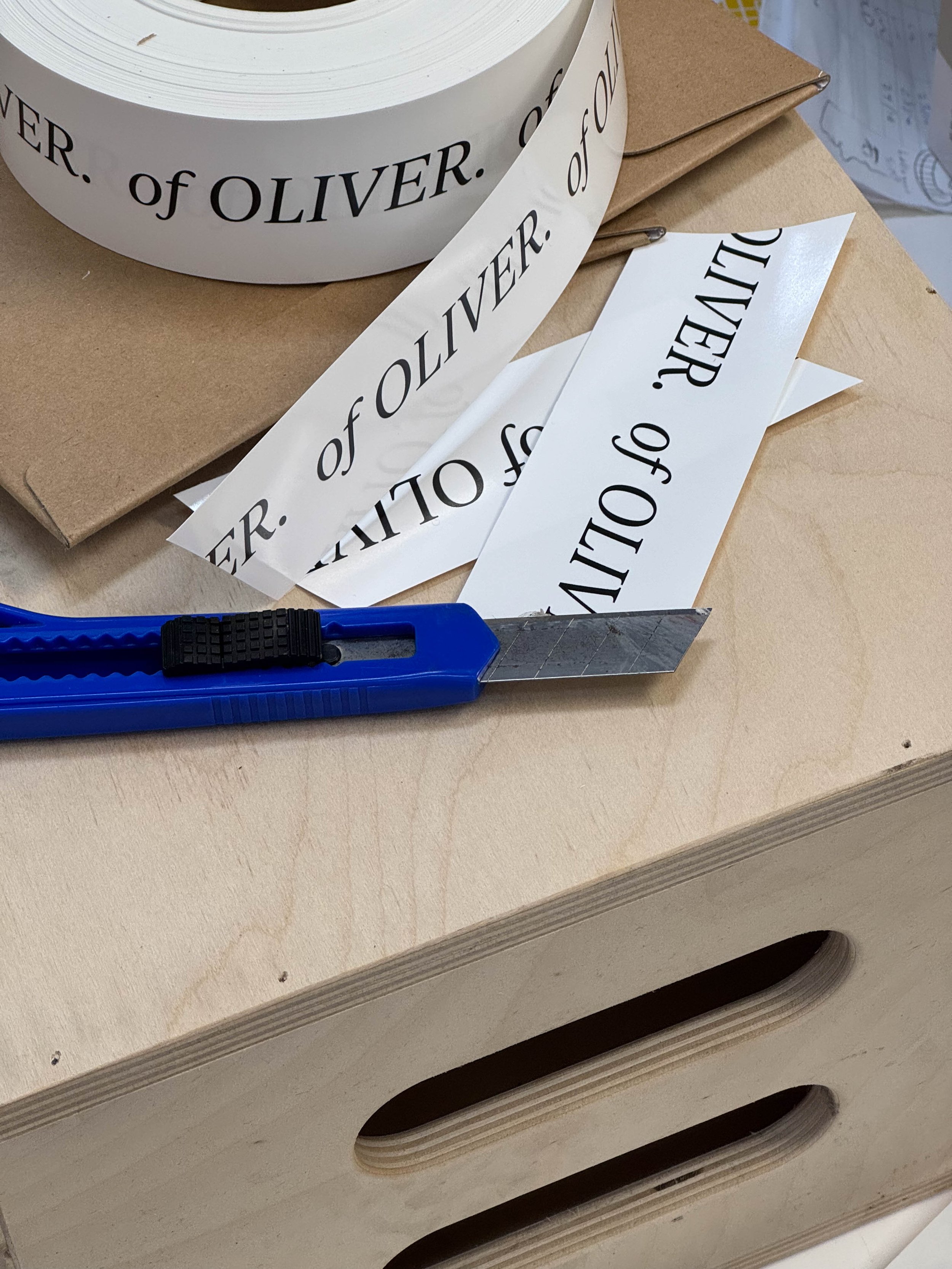
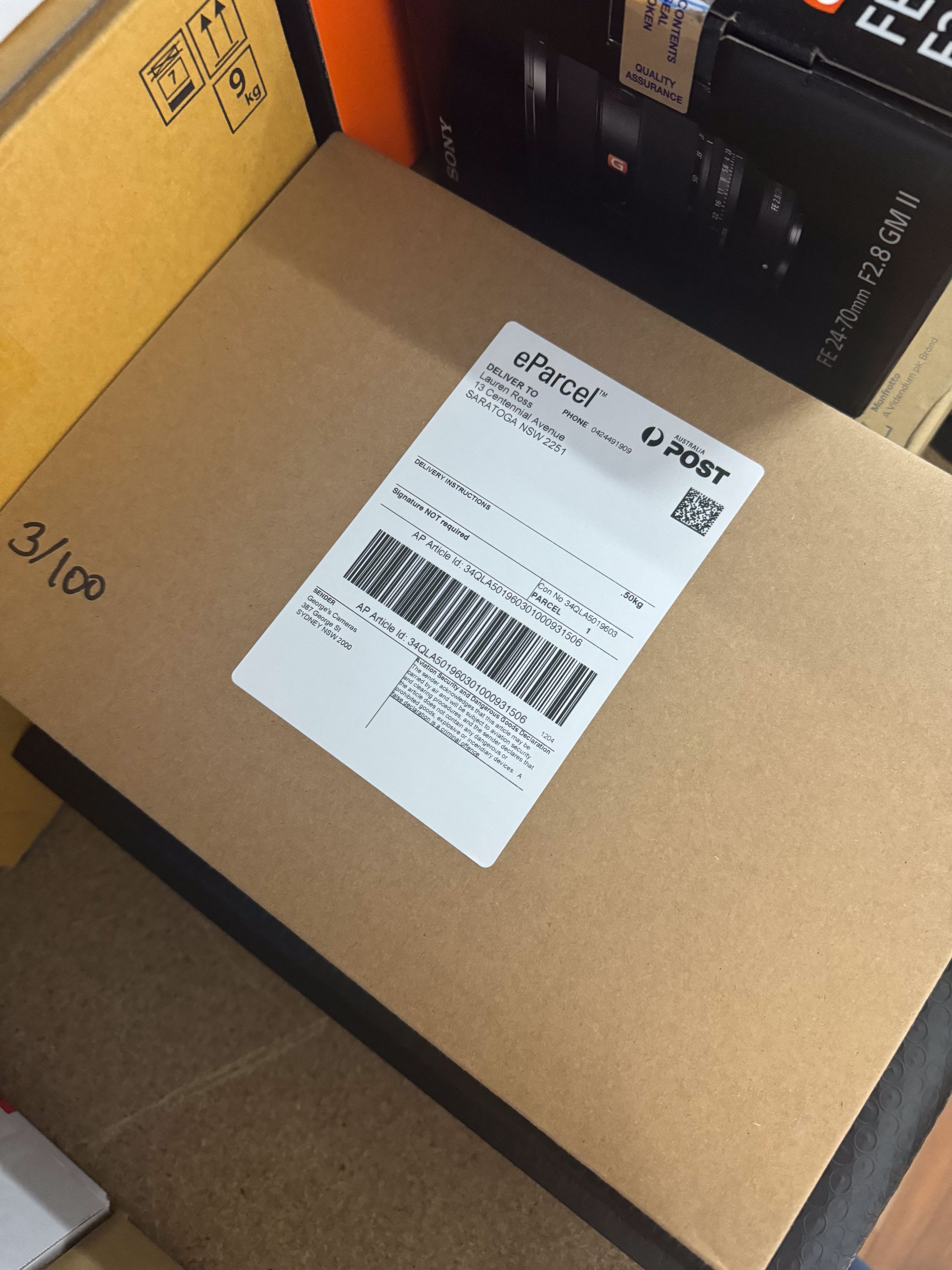
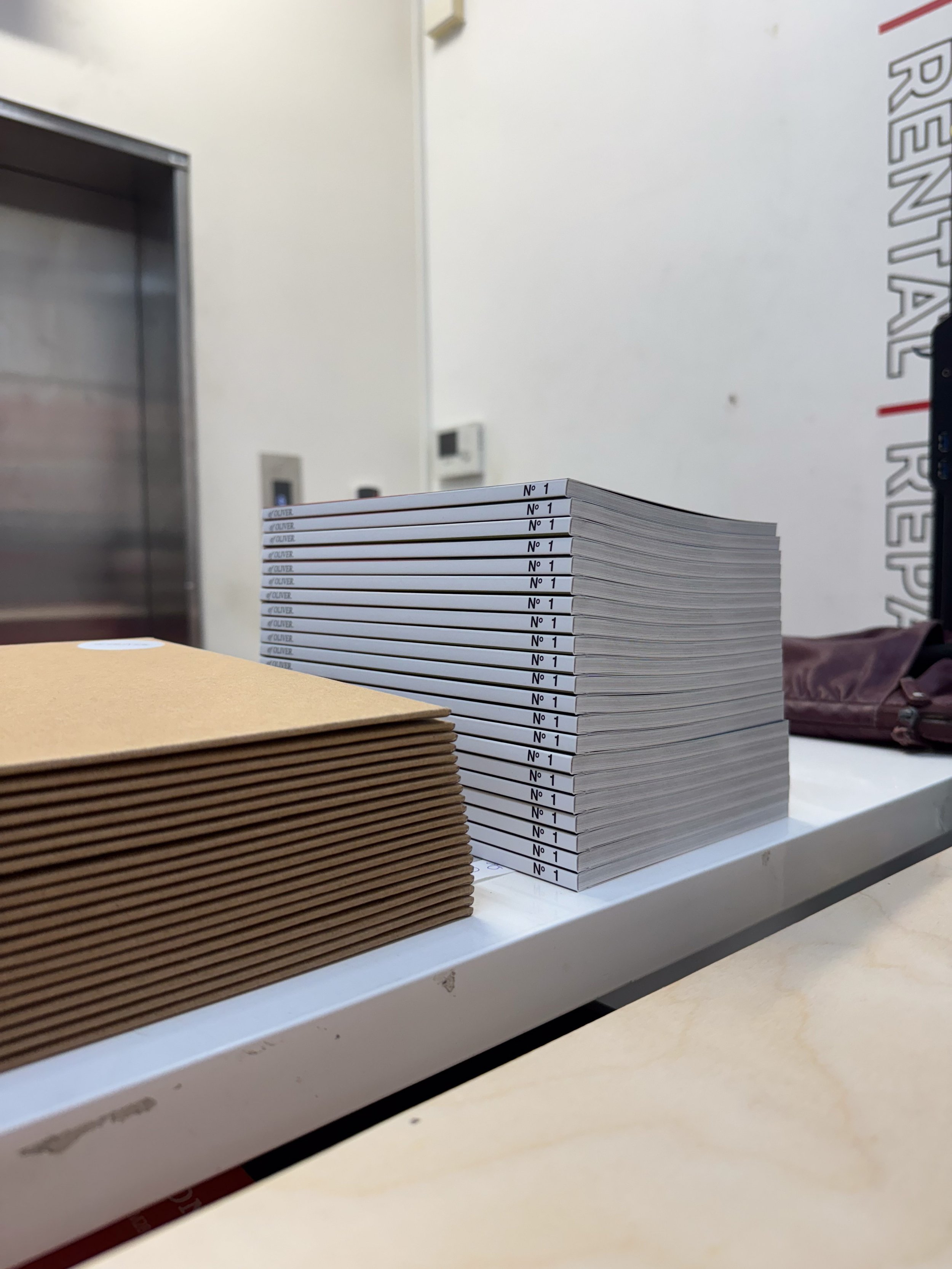
The costs blew out, so let’s talk finances – this Zine turned out to be a heftier investment than I initially thought. I’d estimated that each issue would cost around $6 to print, allowing me to break even after accounting for film costs. However, the costs climbed after deciding to go with premium paper stocks and the printer Mixam, who use an HP Indigo 7200 Digital Press. A machine known for its high-quality prints, high speeds, and relatively low cost (although purchasing one of these machines would cost around $1 million). Their thicker GSM papers gave the Zine a more luxurious feel but also bumped up the price. I also sourced thick oversized card envelopes for mailing and stickers and tape for the branding, with my logo from Vista Print.
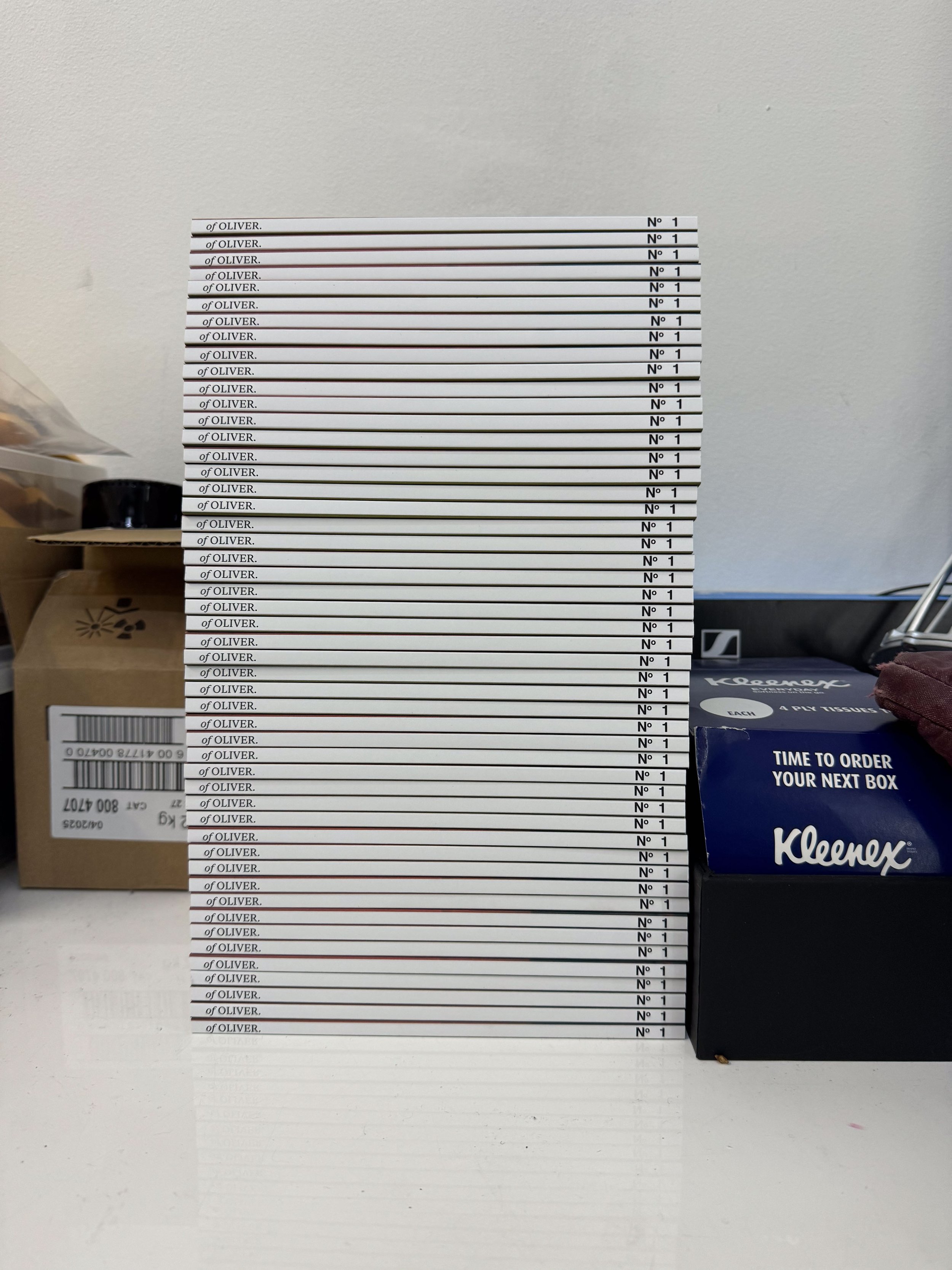
I ended up with a final print run of 100 issues at $35 each. Simple math told me I needed $3,500 to break even. But with the film and the reshoots, the total expenditure rocketed past $7,000. Yes, my wallet definitely felt that!
For fulfillment, I used Square as it was a platform I knew, as I already use it for payment of a lot of my photography bookings.
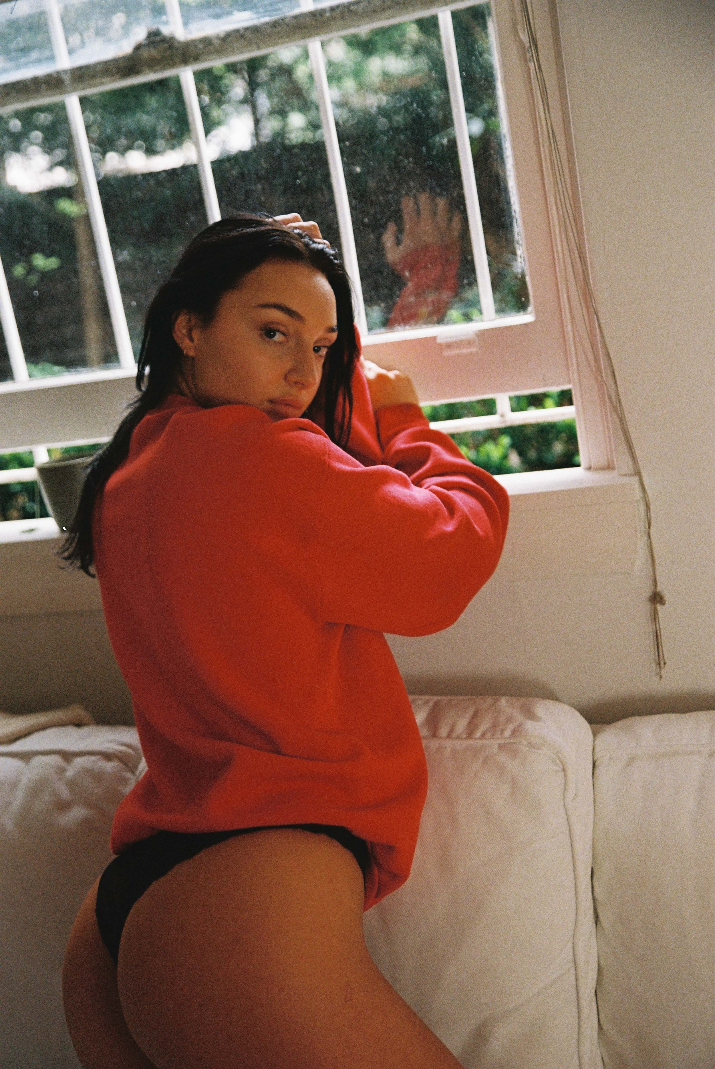
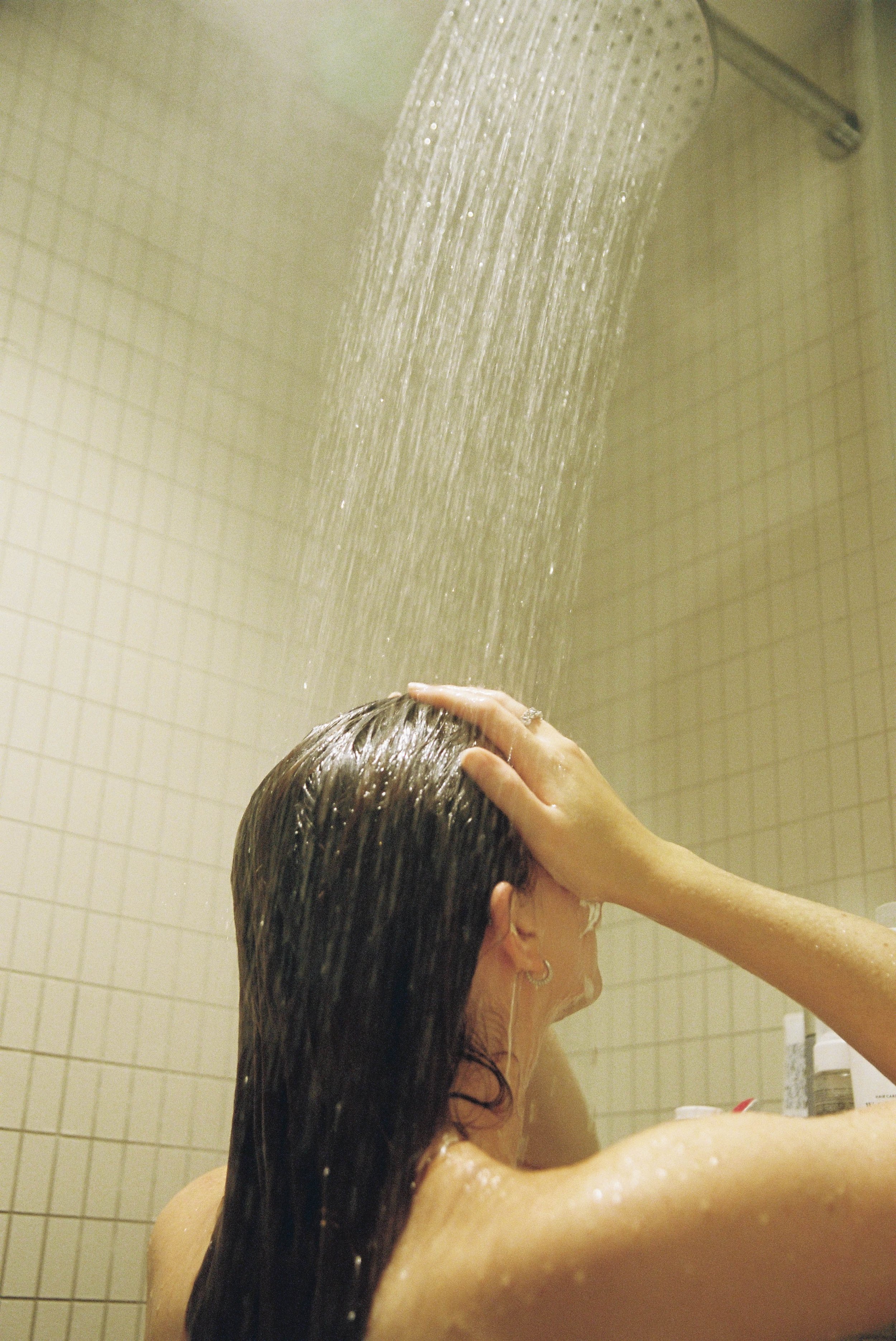
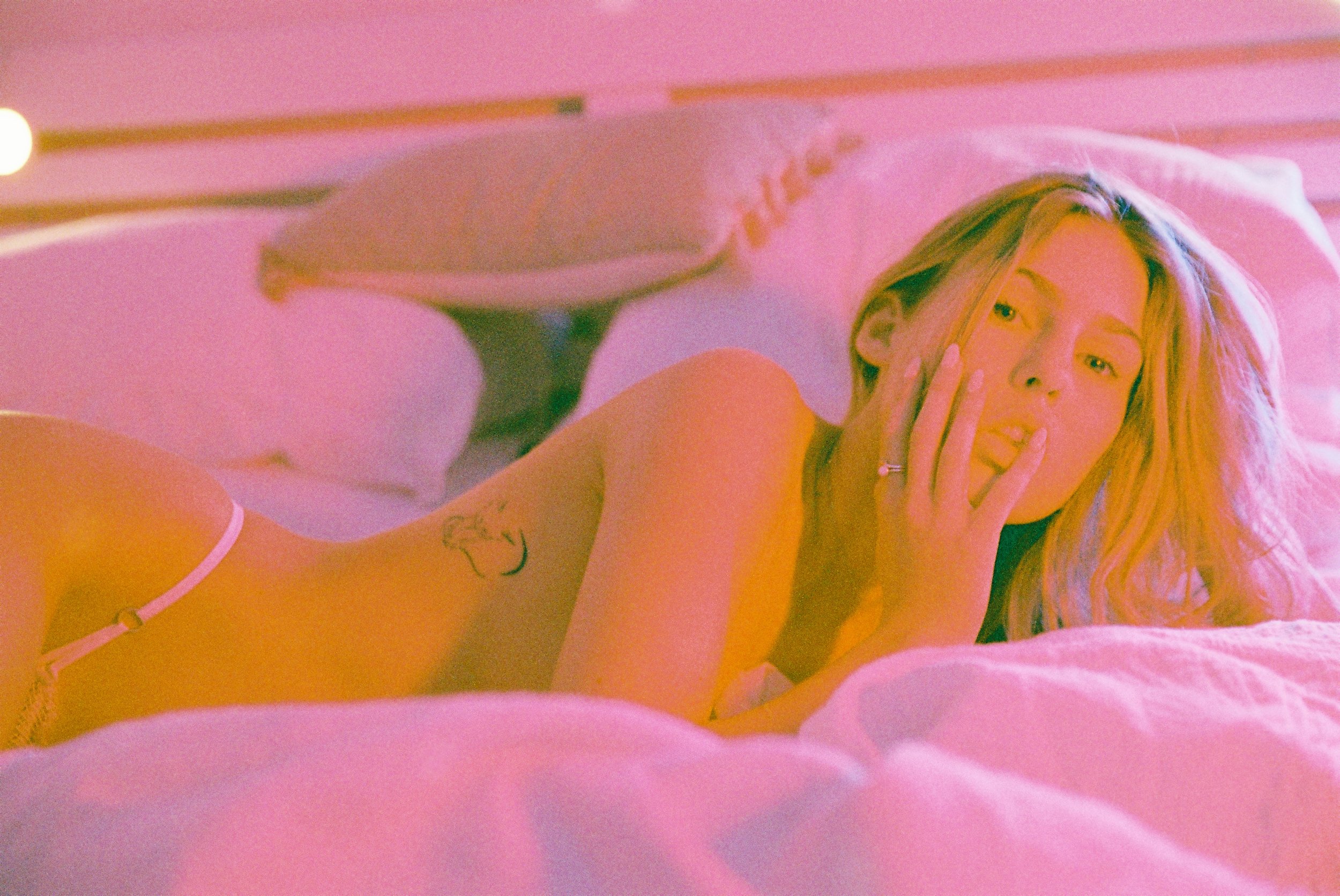
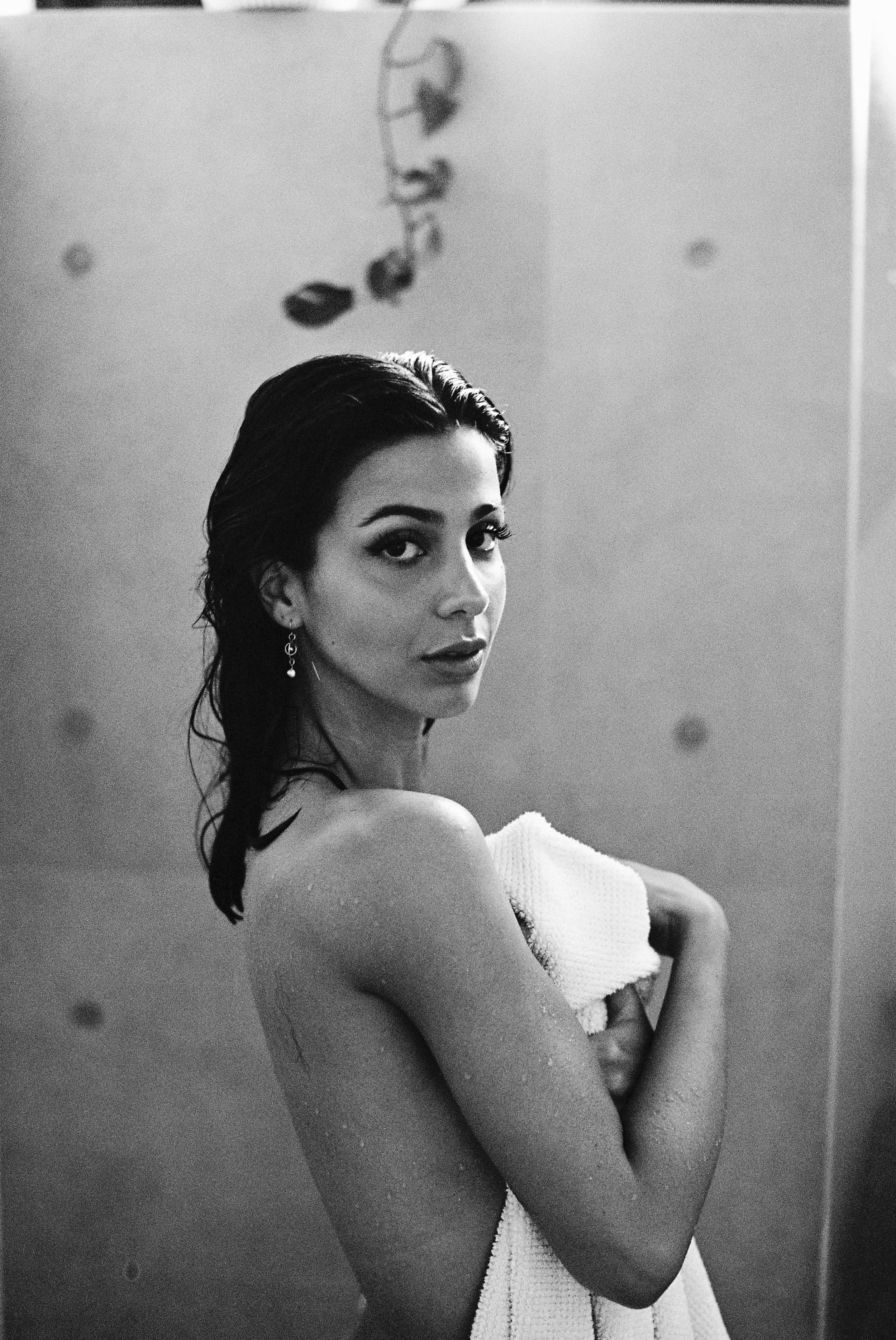
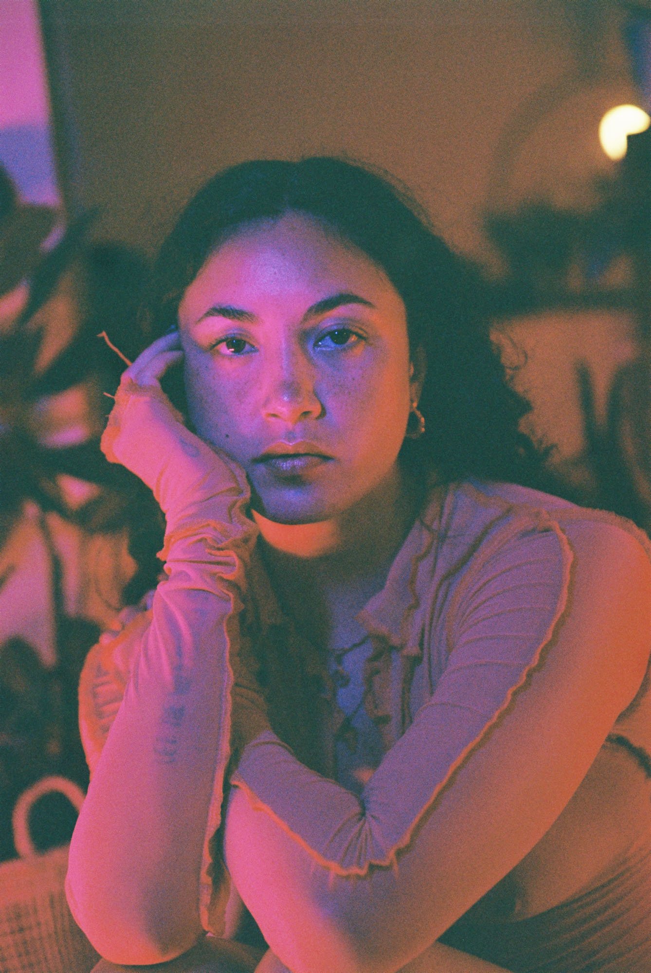
But here’s the thing – this was always a passion project, a tangible representation of my work and creativity. And whilst it took three times as long, I know there is much room for improvement. I am content with having it out there. Every image in the Zine was shot on various film stocks, a mixture of what felt right, but I will say that many rolls of Portra 400 and Ilford XP2 were used in my Canon EOS 3 SLRs. I mainly used my EF 24-70mm f/2.8L II lens, though a few shots called for the Canon 70-200mm f/2.8L IS II and the 50mm f/1.2L.
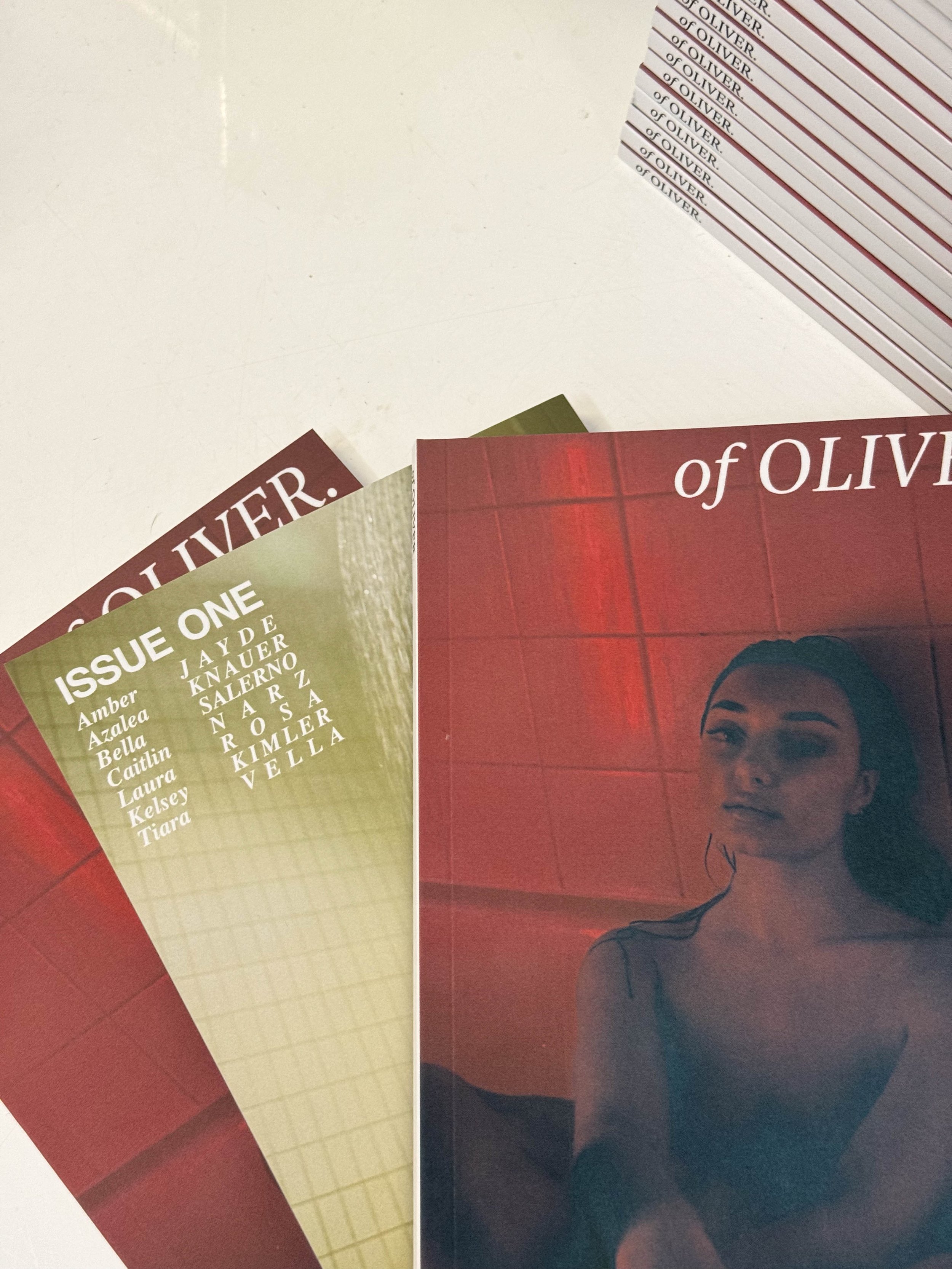
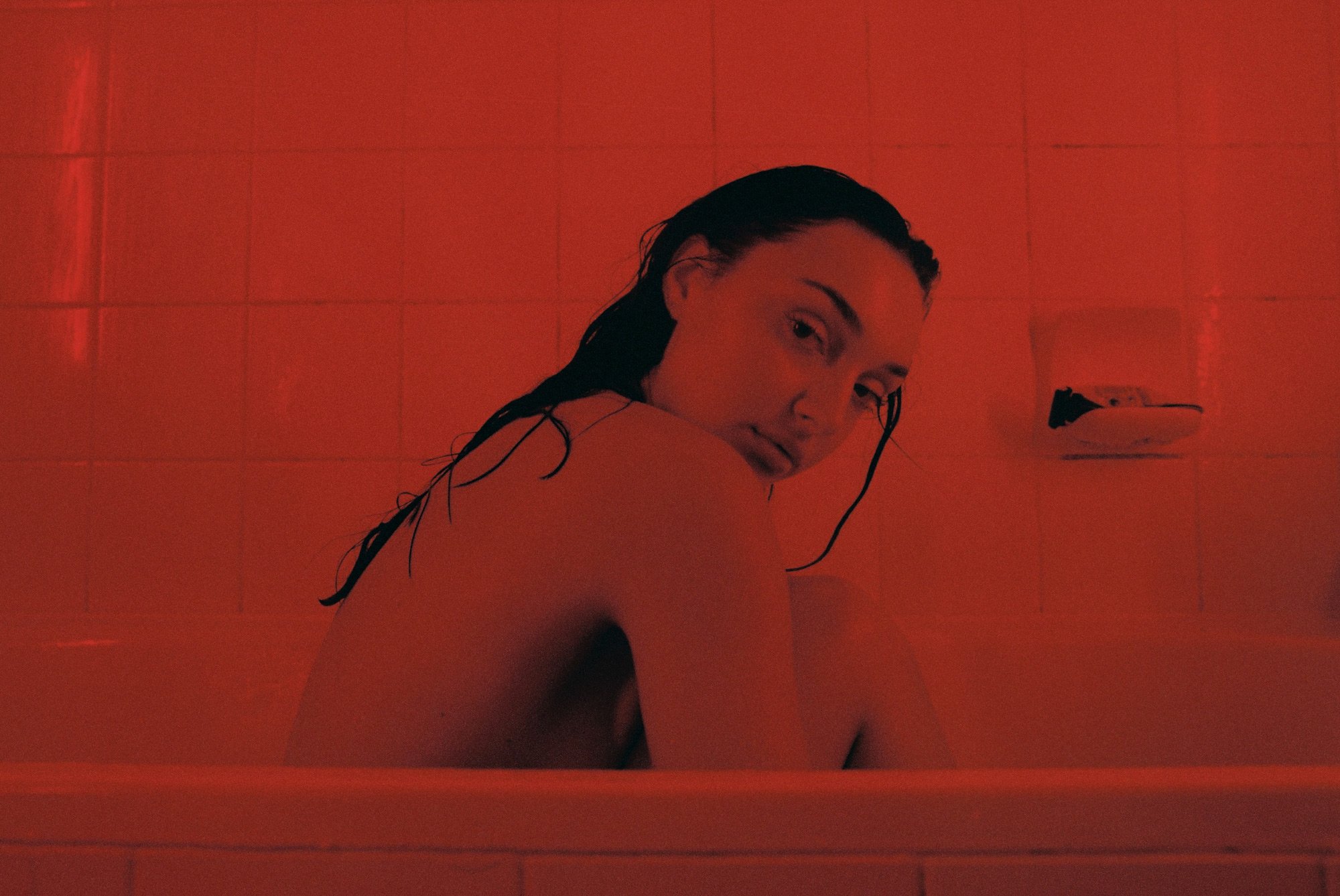
It is a collection of unedited, film-only images, each telling its story. A massive shoutout to all the incredible models – Amber Jayde, Azalea Knauer, Bella Salerno, Caitlin Narz, Kelsey Kimler, Laura Rosa, and Tiara Vella – who brought their unique energy and trust to this project. Their contributions were invaluable, and I’m grateful for each and every one of them.
The same goes for the models who were omitted. I learned a lot, and it had nothing to do with their work personally; I was learning and growing, and with their help, this is what it is.
The three things I recommend to anyone doing a project like this
Budget wisely, and consider the end product, including delivery and packaging; make it make more sense than mine.
Reference and plan the shoots; if I were to do it again, I would probably work with close friends and practice first on digital before shooting on film. Communication with your models and being able to plan out your final product will pay off.
Work with other people; the more support you have for projects like this, the easier they’ll be. Our projects are always better with support, which doesn’t mean from other photographers or creatives; it’s great to go outside your normal circle.
I say all this as I am now working on Issue Two, and if you’d like to be involved, you can follow the link here.
I still have a number of copies of Issue One left you can purchase here.

